I'm Sean Barker, Product Manager at Quest Software. I'm going to go through some of the features that you'll have seen added to your On Demand Audit subscription over the last couple of months. I'll start with some of the additional indicators of compromise, IOCs that we've added to the critical activity widget, and then I'll take you to the interactive visualizations and how those can help you speed your investigations.
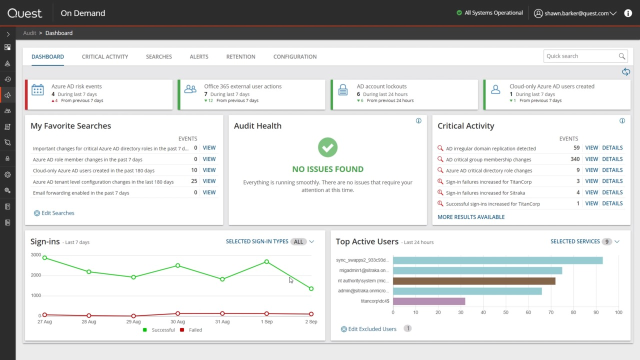
So most organizations that run On Demand Audit also run Change Auditor, and that's because Change Auditor is used to do all the auditing of the On-premises Active Directory activity and log on activity. And then those events are fed up into On Demand Audit and they form part of the On Demand Audit Dashboard and the Critical Activity widget that we'll go through now.
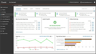
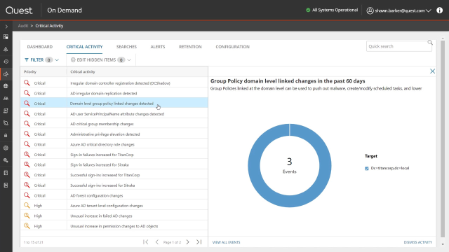
Critical Activity is one of the widgets in the dashboard and it contains all the IOCs that you should keep an eye out for. And to make it easy on you, Audit Health widget prompts you to subscribe to the Critical Activity and the Anomaly Detection Alert Plan. So you don't have to know exactly what to look for, you can just sign up for the Alert Plan at any time, Change Auditor, and on Demand Audit Detection Indicator of Compromise. You'll get an email alert on it.
So there are two types of alerts in the Critical Activity page. The first are the IOCs, so specific events that are of concern in your environment. And the second are Anomaly Detection, these ones with the exclamation mark.
So we've added a number of IOCs over the last couple of months. The first one here is a DCShadow, so this is On-premise Active Directory using a tool like Mimikatz to elevate an ordinary computer to appear as a domain controller. And the reason that adversaries do that is so they can replicate a copy of the AD database and then they've got all your password hashes.
And that's similar end goal to the DC Sync or the AD irregular domain replication IOC where you basically take advantage of the fact that you've gotten access to the domain replication permissions to stand up what looks to be a DC and take a copy of the AD database their replication. And again, once you've got a copy of the database then you've got all the password hashes and access to any of the privileged accounts you want. We've also added IOCs for any links that have happened at the domain level for group policies. Obviously, group policies are critical way that attackers can use to deploy settings that will help them infiltrate the environment. So anytime a GPO is linked to the domain level, that's something that's of concern and something you should look into.
And we've added some IOCs around changes to the service principal name SPN attributes, which would indicate that user objects are susceptible to kerberoasting attacks also possible privilege elevation. So changes that have happened to the admin account attribute, for example, that would show that an ordinary user has been added to a built-in privileged group.
And one of the IOCs that doesn't appear in this list that we've added recently are irregular sIDHistory attribute changes. So if you suddenly see that a SID has been added to an object that's in the same domain, that's highly suspicious. So that would-- is another IOC when pop up as an alert in this widget.
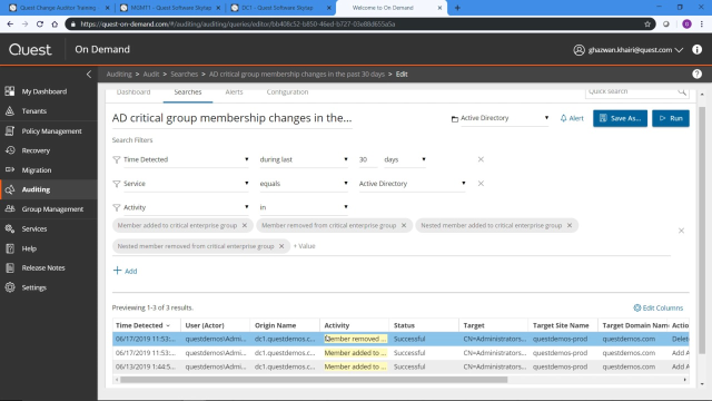
And so the second part of the new capabilities are these interactive visualizations. So the first step is you get an alert there's been an indicator of compromise and you need to investigate that. And On Demand Audit is focused on making those investigations as easy and as quick as possible for you. So now these visualizations are fully interactive. First thing is I can take any of these slices, so in this case these are the different groups that have-- critical groups that have had membership changes. And if I click on that, I'll go right to the list of events for that particular group. So it allows me to drill down immediately from a specific element of that visualization to the events that underlie that element.
So these visualizations allow you to drill down but they're also interactive. So for example, if I have a lot of elements, in this case, a lot of critical groups that show up in this graph I can remove the noisiest ones here. And as I remove certain elements in the graph, it makes the smaller ones more prominent, easier to look into and to drill into deeper.
Now let's look at one of the anomaly detection critical activity alerts. So anomaly detection is looking at patterns in the environment across your tenant, or your on premise Active Directory, and showing you when there's been an increase, suspicious increase, of activity. So in this case, these are successful tenant sign ins and we've had this anomalous spike which is way off the baseline. And again as with the previous visualizations, I can take any data point in this graph, click on it, and drill into it.
So in this case, I'm looking at the anomalous number of successful AD Sign-ins. So historically, what we had is a list of all of these signs and I could go through the individual events. The new interactive visualizations are going to make it so much easier to determine if this is all these anomalous sign-ins are coming in from a one user or coming in from a whole series of users. Maybe it's just one user that's been compromised. Maybe it's a number of users that are falling victim to a password spray attack or a dictionary attack.
So with the new interactive visualizations, I can now configure any search, whether it's built in from the critical activity widget or one that I create myself, to display as a visualization as well. So I still have the underlying events at the bottom, but now I can tell really quickly at a glance that all of these successful sign-ins for the anomaly came from six different users. Again, I can interact with this. If these are expected signings here I can remove that and I've got the ones that remain. And if I drill into specific elements of that chart, it'll also drill into the specific-- it'll narrow the specific events at the bottom as well.
So that was an example of a visualization showing the results of one of the built in critical activity alerts. But I can also employ these visualizations for any of the searches that are included out of the box in On Demand Audit as well as any searches that I create myself. So I'm going to take this search for example, which is a list of all the attribute changes that have happened in Active Directory over the past seven days. With a lot of these searches, there's a lot of activity that happens and you'll see there's 2,700 results, which is it's a difficult volume of data to make sense of.
So again, if I go to Edit Layout and click on Visualize, I can configure this to show both a chart and the grid of events, choose the donut event, the donut visualization, and I'm going to group these by activity to show the different types of attributes that have changed. So now I'm starting to make better sense of all of the attributes that have made up these 2,700 events over the last seven days. I get the top 10 by volume. So if I hover over any of these items, I can see that these are largely permission added permission removed events. They're very noisy. I can limit those and remove them for the visualization so I can really drill down into the ones that are a little bit less noisy.
And this bottom slice is all the others. So you know I've got the top 10 that are showing here but if I drill into the others, that'll basically take me a step down to the next 10, so from the 11th to the 20th my volume attributes that have changed an Active Directory. And again, I can interact, I can remove any of these from the visualization to drill down to the ones that may be of concern to me.
And if I click on any of these bars, it's going to narrow down the associated events underneath. And so I always have access if I've configured my layout to show both the chart and the grid to the actual events that are underlying these visualizations. And this allows you to get to the information that you need much more quickly by interacting both with the visualizations and filtering the list of events dynamically.
So let me select a different search and show you one of the other visualizations. So in this case, I'm going to look at the all security changes in AD within the last 30 days. So when I run the search by default I get a list of all the events. If I go to Edit Layout, this does allow me to customize the columns. These are built in searches. So if I want to make any changes to these or if I want to add that visualization and keep it there for later, I just need to save a copy of this search and I'll be able to rerun it and it'll be restored to the exact same configuration that I've set here the next time I run it.
So I can configure the columns but the new tab is the visualize column. I'm going to do the chart and grid, again I want to see both the visualization and interact with it and see the events below it. And I'll take the time series one in this case.
Group by activity again. And because it's time series and just need to summarize it by hour, day, week. So this is 30 days, so I'll just summarize it by day. And this will show all of the permission changes, security changes that would happen in Active Directory over the last 30 days.
And the reason why these visualizations are so powerful is so I see there's only three types of security changes over the 30 days, this permission added you can see there's a massive spike over a few days here in the 11,000 to 12,000 range and it really dwarfs these lower items in the visualization, so I can quickly remove that from the visualization. And then I see more fidelity when it comes to the items that are lower down in the graph here.
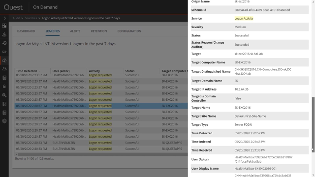
And as I narrow these down again the actual events below are narrowed as well. And I'm going to select a third event. In this case, I'll take all the failed login activity in the last seven days. Again, this is login activity that's coming from my On Premise Active Directory to show the third visualization that we've introduced.
So Edit Layout, Visualize, want to show both the visualization and the grid. Take the horizontal bar chart. And because it's login failures, I want to group it by the user or the actor who's seeing the failed logons.
And so it's the third visualization. In this case, I'm seeing the actual users that are failing to logon and generating these events. And as with the other visualizations, I can remove specific elements from this bar chart to make it easier to drill into the ones that are a lower volume of events. And if I click on the others it'll drill down to the next set, the number 11 to number 20 in terms of volume of the actors that had failed logon on events within this period of time.
Now if this is a report that I want continuous access to in the future, I can just click Save. Save it to my personal searches. And it'll actually save the layout as well. So I'll have both this visualization that I've chose, and the bar chart, as well as the results based on the filter here.
So we've just reviewed the new indicators of compromise that we've added in On Demand Audit. And we'll continue to add more of these both an On Premise AD and in Azure Active Directory and Office 365. And the new interactive visualizations that we've made available that will really help speed your investigations and get to the bottom of these critical activity alerts that are raised in the dashboard.
For more information about On Demand Audit, please visit the URL on the screen.
 11:09
11:09