Hello, my name is Robert Pound. And I am a product technologist for Quest. Today, we're going to look at the pivot grid in Toad Data Point and how you can work with data. So I have a pivot grid tab open. And we're ready to start manipulating the data.
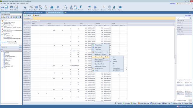
So first of all, if we look at the-- in this case, we have a quantity in the data area, I can actually bring in the same value to the data area. We have a duplicate value now. So if I right-click on this value and choose Value Field Settings, you can change the aggregation type, show-- change how the value is displayed. You can also affect the number formatting.
And again, we can change the aggregation type. So we could, for instance, change this to an average. And it's changing the custom name because of the aggregation. But if we wanted to modify this to something else, we certainly could. Quantity one, for instance. And we'll go ahead and click OK.
Now we have an average value in here as well as the sum. And those two features are actually also available in the right-click menu themselves. So for any given field, if you right-click, you can change the aggregation type and the value that's shown.
You also have the ability to do conditional formatting on this data. So if I choose Format Rules in the right-click menu as well, you have specific values that you can set or you can do a top 10, bottom 10, et cetera. I'm going to go ahead and do a top 10% just to highlight how it works. Again, similar to Excel as far as conditional formatting goes.
So let's go ahead and highlight the top 10% with red fill. And we'll just do the top 15 just because. We'll go ahead and click OK. So now it's formatted out. And you could continue with conditional formatting as you see fit. I'm going to go ahead and clear this rule.
And you can also Add row and column totals. Right-clicking here in the columns, for instance, we can show column totals, show row totals. And it will give you the total values.
We can also group by. So currently we have Date here in the top. So if I right-click, I can choose Group By. And instead of looking at the months on this date field, for instance, we can look by day, by weekday, et cetera. So it all depends on how you want to look at it.
And then looking at the chart. So currently we see that it's blank. And that's because we have the chart selection only. So in that case, if we grab a section of it, it will start to chart out what we have highlighted. If you want to see the full view and all the time, you can just deselect this and it will show you everything that's currently being pivoted.
You can also have point values on or off. So now for each one of the bars, we see the actual value in the chart. And obviously, you can also do things like change the type. So we could do a stacked bar, or pie charts, or what have you.
And that's all I had to share today about working with data in the pivot grid. I hope this video was helpful. For more information on this topic or other topics, you can check out the help file. It has a wide range of information and tutorials to help get you started.
You can check out toadworld.com. I highly encourage you to log into the tool so you can get content specific to Toad Data Point. For more information on this product, you can go to www.quest.com/products/toaddatapoint. Thank you and have a great day.
 04:22
04:22