
I once attended an excellent training on giving effective software demonstrations, and the main point was simple: Don’t make your audience wait - show them the good stuff FIRST!
So here it is, in just three steps in Spotlight on SQL Server Enterprise‘s Wait Events drilldown, you can find out what your heaviest queries were, for any recent time range:
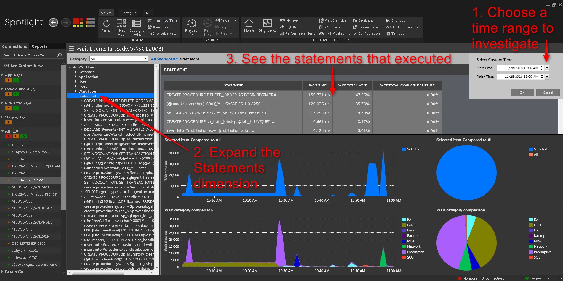
This really “turns on the lights” in terms of knowing what’s happening on your SQL Server.
What You’re Seeing Here
As easy and intuitive as that was, this screen is richer with information than you might imagine, so let’s zoom in and break down piece-by-piece what you’re seeing.
Time Range
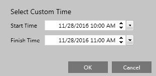
You can look back over any time period in the last week if you’re using Spotlight’s default retention setting, and you can go farther back if you’re willing to give Spotlight the repository space to store the additional information.
Workload Graphs
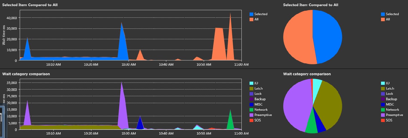
Notice that the two graphs have the same shape and cover the same time period. The top shows the overall workload (in milliseconds) generated by queries running on your SQL Server. The part in blue shows just the workload that came from whatever statement/application/user/etc. you’ve selected in the tree control to the left of these graphs, and that can be seen against the backdrop of the total workload, which is shown in orange.
The bottom graph shows the total workload, but this time broken down by the specific types of work exerted on each your SQL Server resources (CPU, IO, Log, etc)
Dimension Tree and Detail
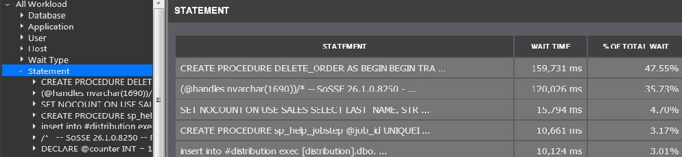
By expanding out the Statement dimension in the tree control, we’re seeing that statements that ran during our selected time range, ordered from heaviest to lightest. Notice the CREATE PROCEDURE statement appearing at the top of the tree also appears at the top of the detail, because it created the most workload (159,731 ms for all executions of it during our time range, making up 47.55% of all workload on the instance).
Exploring Different Dimensions
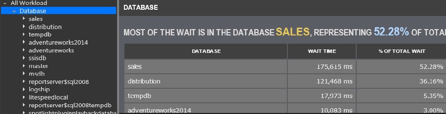
You might have noticed that there are other dimensions in the tree besides the Statements dimension. Let’s take a look at how we might use those. Suppose you’ve got a SQL Server instance with lots of databases on it, and you’d like to see how the total instance workload is distributed across those databases. To see this, in the dimension tree just expand Databases to see them listed in descending order from busiest to least busy.
In our example below, sales is the busiest database during our time period, making up 175,615 milliseconds, or 52.28% of the total workload:
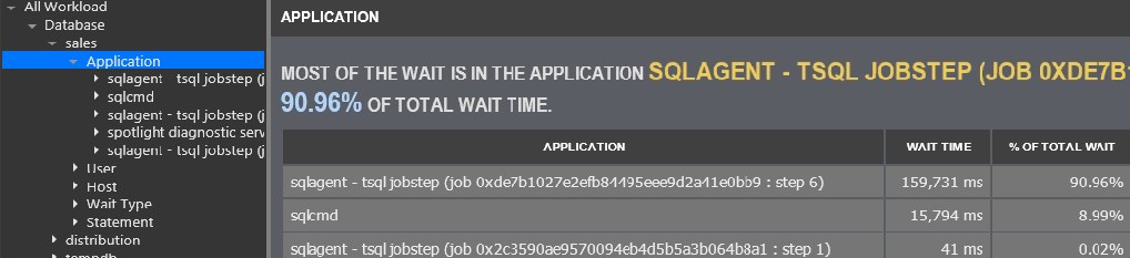
Now that we’ve established that the sales database is where the action is, we expand it and then expand the Applications dimension in the branch below it to see what programs were making requests of the sales database. In the example below, we can see that the SQL Agent running a job (with Job ID and Step number shown) had the biggest impact on the sales database, making up 90% of the workload on it:
And we can even go a step further. Now that we’ve established that the SQL Agent (running a specific job and step) was the heaviest hitter, we can expand that branch and in turn expand the Statement dimension beneath it to see the statement(s) that the application ran against the sales db. In this case just a single statement was run, and we can click on it to view its text:
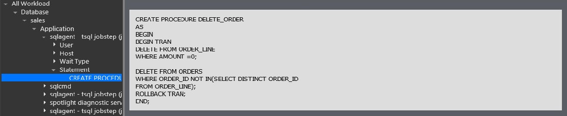
Notice that we ended up at the same statement (the CREATE PROCEDURE proc that we saw earlier) – we just arrived at it via a different route, doing a bit of filtering first.
This is just one example of using the Wait Events dimension tree – you can see workload ordered by Users, Hosts, and more – whatever helps you make the most sense of the data Spotlight has collected. The best way to get the hang of it is to just click around and explore.
Ordering by Different Resource Types
Spotlight has conveniently categorized the hundreds of different, cryptically named SQL Server wait types into categories that are meaningful to users. Here’s the list:
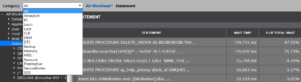
Notice the default is “All”. That means that when you see a list of statements, databases, applications or users ordered from heaviest-to-least in the Wait Events screen, the ordering is taking into account the sum total of all workload types. But what if you want to see statements ordered just by their IO impact? Simply choose IO from the dropdown about, and ordering will now be done by IO.
The Workload Analysis drilldown
Spotlight’s Workload Analysis drilldown works exactly as the Wait Events does – it’s just a separate screen because it deals with different units of measure. While the Wait Events screen is all about milliseconds of workload on SQL Server resources, the Workload Analysis screen covers metrics like query duration (as experienced by the requesting user/application) and read and write counts.
Why All This Matters
Understanding your SQL Server down to the level of workload generated by individual statements is very powerful information because it makes it easier to address SQL Server performance issues by finding statements that are candidates for optimization and tuning, rather than by just throwing hardware at the problem.
What Spotlight’s Wait Event and Workload Analysis screens bring to table is easily obtained and readily actionable statement workload information. While SQL Server itself does natively include some performance monitoring tools like the Profiler, DMVs, Extended Events and the Query Store, all require considerable amounts of skill, time and attention in setup, administration and interpretation of the results. Spotlight’s approach takes care of all of this, providing a turn-key way to get clear SQL Server workload analytics.
All of my Quest Database Performance blog posts can be found here.
