
This is something I always cover in "tips and tricks" sessions with my customers. It's an easily overlooked "extra click" that can lead to a bit of frustration, but I'm here to let you in on it.
Within the Foglight UI, you can select your time range with the pulldown (1). You can either pick a pre-defined sliding timeline, or use a calendar with from/to date and times. Don't worry about granularity within SQL PI. Keep an eye on the metrics in the lower right.
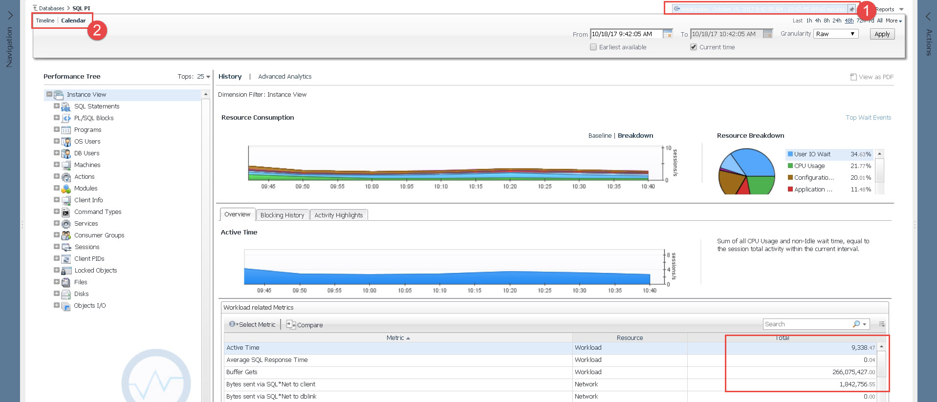
I selected "72 hours" and the graph for workload and the metrics updated to reflect that most recent 3 day span.
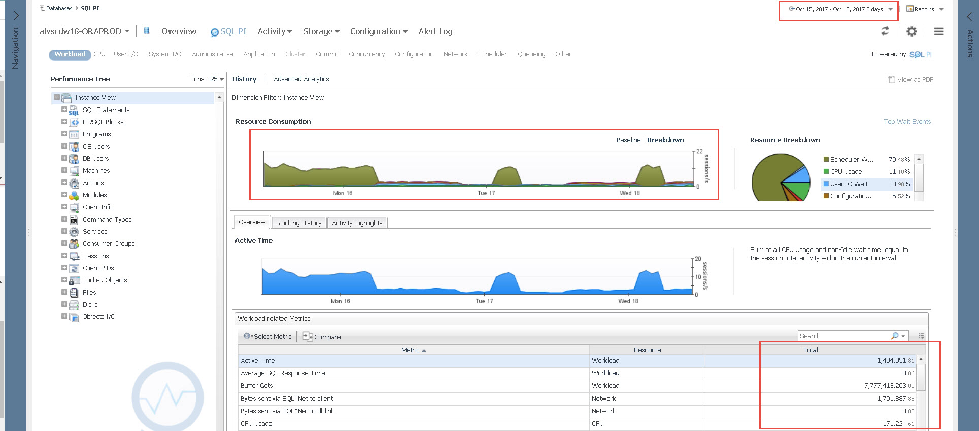
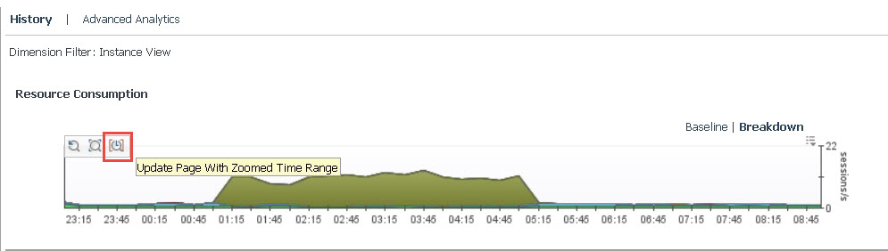
Let's say I want to investigate the spike in activity on Tuesday the 17th. I'll drag the X axis (your mouse cursor will turn to an X) and highlight the "blip."
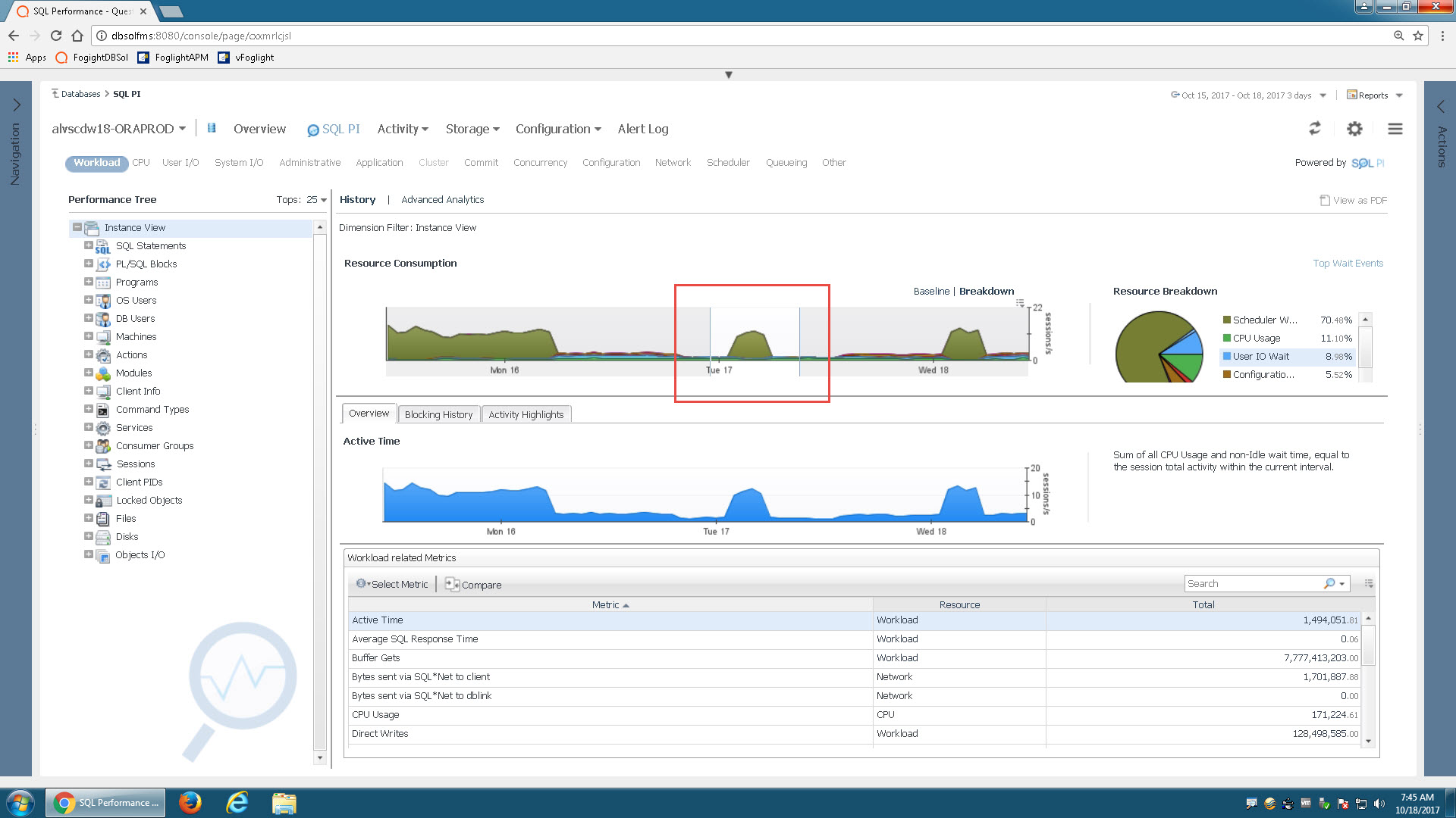
The graph zooms to the area I selected, but you'll notice the metrics didn't change!
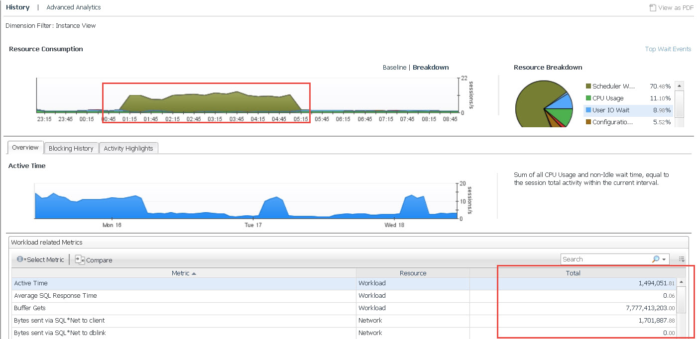
Here's the tip! You need to click the icon in order to "Update Page with Zoomed Time Range."
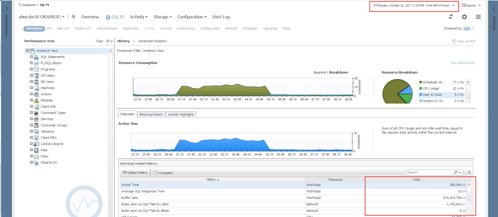
You'll notice the time range selector has now been updated (from 3 days to 9.9 hours) and the metrics changed. In addition, the drilldowns in the Performance Tree now reflect this new time range so you can continue your investigation.
This is a common Foglight UI trick, so it's applicable to other dashboards that you may need to zoom in on to isolate a problem.