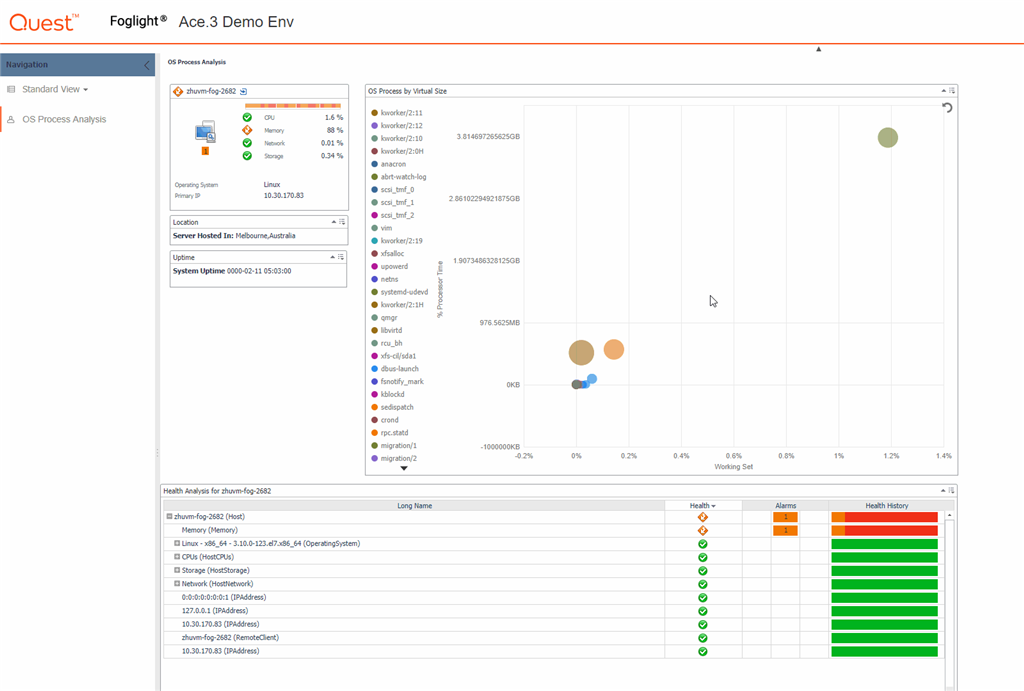
Investigating a rogue OS process is a pain; digging through the multitude of metrics, different times of days have different outcomes, alarms that come and go and customer complaints to accompany it all. This is just one example of problem troubleshooting in the datacenter I used to have to handle as a consultant working with businesses; creating performance monitoring practices doesn't happen quickly.
I used to wish I could quickly and easily pinpoint the issues we were tasked to resolve, luckily I have an awesome RnD team that have the same wish. The result, a stack of new visual analytic charts that we are bringing into the next release of Foglight for Virtualization and here is an example of using the new Foglight Bubble Chart in a Drag n Drop dashboard.
Coming soon to Foglight for Virtualization
Give the image a click..... its a GIF


