
The bigger the application, and the more composite it is, understanding its Topology becomes a lot more important. What is connected to what? How are the flows for the transactions? Where are the bottlenecks and the slowdowns?
I have seen some really ugly Topology diagrams. The one that comes to mind was one that one of my customers showed me. It was a ring. I should say it was like a pearl necklace, with about 50 pearls. And they were all connected to each other. It was something like this first image. It was ugly. Or at least I think it was.
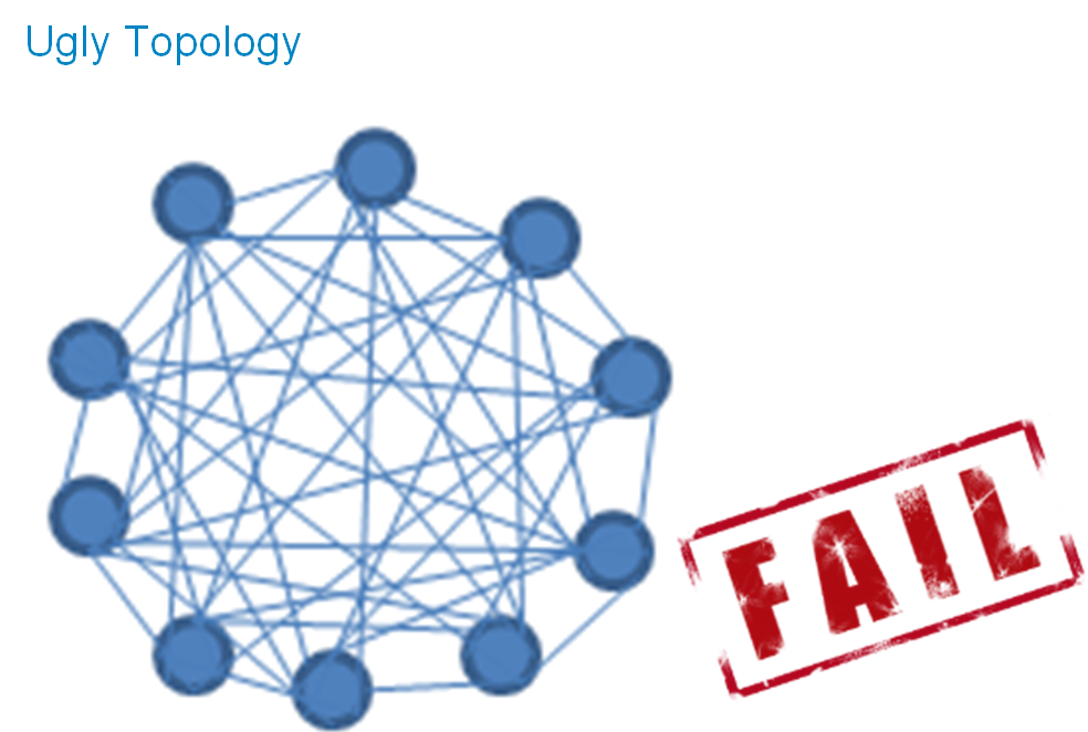
I gave it an “F” in my mind. But since the customer was using a competitor’s product, I did not want to upset them. I did not say anything. Well, I offered to show them how we display the Application Topology. Then I showed him this one. It was time to show off just a little.
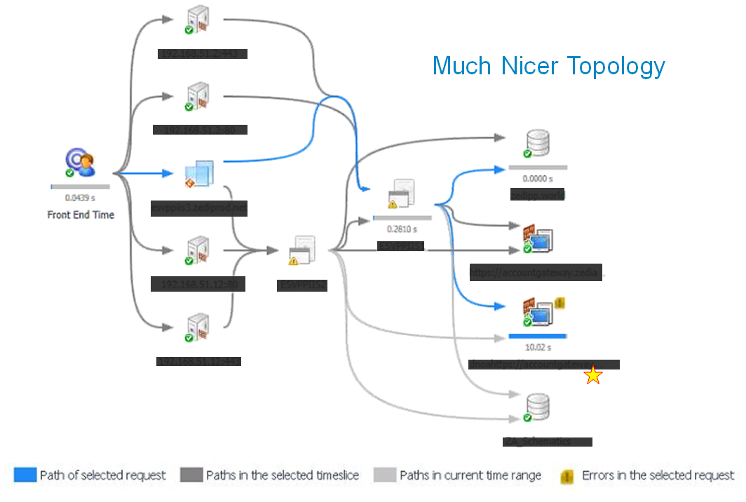
Our Topology diagrams offer a lot. More components you monitor, the richer the Topology Diagram look.
It is really valuable when you can show the overall flow of transactions. And you can differentiate between the aggregates and the individual transactions.
Please provide your feedback as I like to hear your perspectives. It would be great if you can tell me what else you would add to my list. I mostly learn from my customers.
