
It might appear initially that the Azure SQLDB dashboard is just a real time view (with an hour’s history) but actually there are lots of ways of view the data back over time.
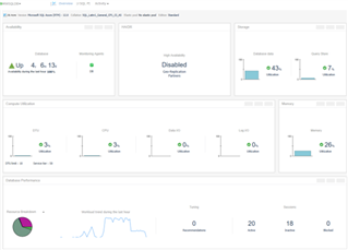
The first thing you might have tried is clicking on a graph eg: DTU
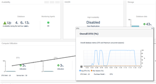
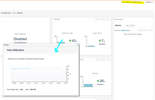
In the image above I’ve clicked on the DTU graph, and the history pop up appears. And this will work for most of the images such as database utilization and memory utilization.
However, you might say, hang on that’s still only the last hour, how do I see more history?
Well, that is still available by changing the default time range in the top right-hand corner.
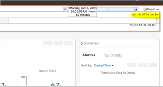
So, if we want to see a chart over 1 month, we can click the 1m icon.
Here I’m showing the data storage utilization over one month:
But what if want to compare various metrics over time on the same dashboard and want a time range that is more specific to your needs, like a particular week last month.
Consider getting an email, like the one below and you want to know how often in the past you have hit a DTU limit and want to graph it.
This is where the beauty of Foglight comes in. We just create our own dashboard.
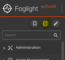
Open a classic web console, shown in yellow below
Open the right drawer and create a dashboard / use all data
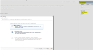
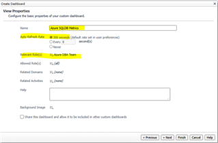
I will give mine a name such as Azure SQLDB metrics and share with the azure dba team.
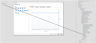
Choose fixed size, and then click cancel on the add view element page. At this point you end up with a blank page.
Next, we need to a data to the page, so click the data tab and locate your metrics.
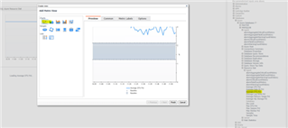
I will select a number of metrics, like DTU limit and drag and drop the metric to the left blank space.
Click line graph chart and click finish.
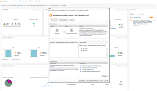
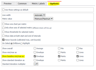
I then add Average DTU Pct as a chart but I want to also see the anticipated baseline, example below:
If you click the general tab you can then move the charts around or make them bigger. Here is the final view:
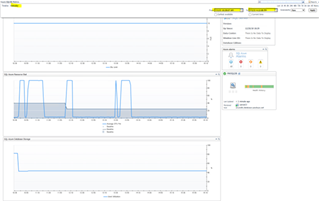
And the main takeaway here is that I can pick the exact time range I’m interested in.
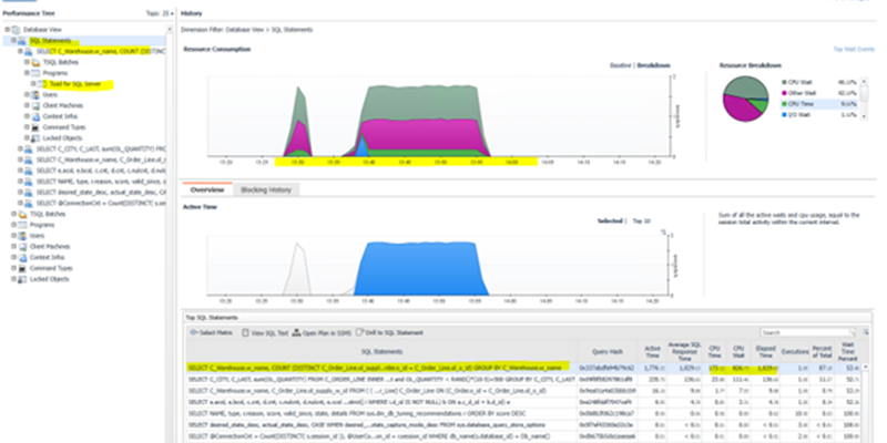
And from here if I want to know what SQL caused the spike at 13:30 to 14:10 I can look in the SQL PI dashboard:
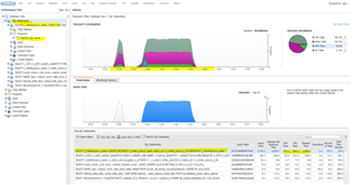
In the screenshot above I can see the query and how much CPU time it consumed or was waiting for.
Download a trial of Foglight configure it to monitor your SQL DBs and Elastic Pool https://www.quest.com/products/foglight-for-cross-platform-databases/
