Spotlight users sometimes ask if it offers baseline capabilities. Though Spotlight does not learn a baseline of workload activity, it does provide the ability to view particular metric values over customizable timeframes. In doing so, it may allow for understanding a metric’s typical value….or loosely, its baseline range.
Here is an example using the SQLServer Page Life Expectancy (PLE) metric. For some context, Page Life Expectancy reflects SQLServer memory pressure. More specifically, is a measure of the duration (in seconds) a data file page is expected to stay in SQL Server's buffer pool. This metric is not an aggregate. Rather, it is a point in time. Microsoft recommends maintaining the PLE minimum value of 300 seconds (5 minutes). So, DBAs will sometimes need to see its value at points in time, over time.
To view this metric in Spotlight, select the Monitor tab, then the Memory dashboard button.
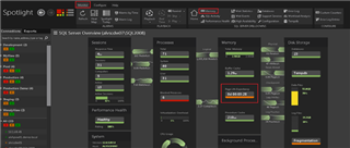
Alternatively, the SQLServer home page displays the PLE metric and you can select it. In this example, a visual alarm is firing because the threshold value fell below 5 minutes.
(Click on images to enlarge)
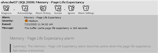
By following the active alarm, Spotlight provides a dialog with some details about the metric like what is measured, what value to maintain, and what to do if the threshold is crossed and the alarm fires.

…etc…
From here, select the Diagnose button (top left).

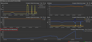
This is the Spotlight Memory dashboard. At the bottom, you’ll see the PLE metric displayed as a graph over time.
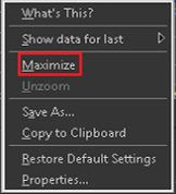
Via the right-click menu, there are a couple of helpful options.
- Maximize – Have a closer look at the metric.
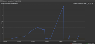
- Modify graph timeframe (X-Axis). The default is the last hour.
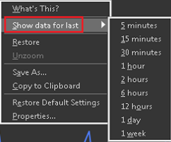
To better understand the metric’s value historically, Spotlight users can select the option found in the top right corner of the graph.
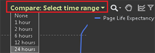
The list of timeframe options is the increments of time to go back. So, in this example, the graph shows data collected between 1 pm and 2 pm. Choosing 1 hour would compare the value to the metric’s value an hour earlier, then the hour before that, and so on (1-hour increments). Choosing 24 hours (as shown here) would compare the value at the point in time chosen between 1 pm and 2 pm today to that same point in time yesterday, the day before that, and so on (24-hour increments).
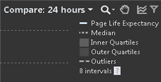
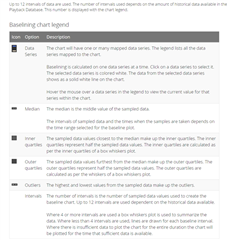
There is a legend that defines the plot lines and shading in the graph (top right).
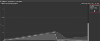
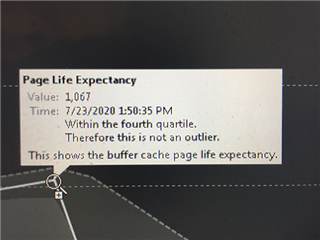
For a quicker way to determine if the value is normal or typical, simply hover over the graph for a summary of that data point including the value and whether or not it is considered an ‘outlier’.
With all of this talk about what is a ‘typical situation’, for your listening pleasure, I leave you with this…
…not PLE….but DMB…. https://www.youtube.com/watch?v=qjV-SHCDlec
To learn more about Quest’s Spotlight and to download a free trial, visit Spotlight on SQL Server Enterprise


