
Foglight 5.9.3 (core Foglight release) includes among its features new components for building dashboards called “analytic views”. The new view types are: Scatter Plot Chart, Bubble Chart and Tree Map Chart.
Specifically, I’ll cover here how to use these in the Foglight “Drag and Drop” interface to easily create new views that can show your monitoring data in new, powerful ways.
Note that the acronym WCF is used in this post. That’s the Web Component Framework, the built-in IDE for dashboard and report development in Foglight. I’ll explain that as we go, but basically it’s another way to build views and reports in Foglight other than using “Drag and Drop”.
Also note that “actions” can be added to these views. You might want to have a particular detailed view pop up when the cursor hovers over a plotted point on the chart. I’ll describe how that can be set up.
A Related Webcast
This material was also covered in a recent Quest "Foglight Skills 101" webcast. Here is a link to the recording, so please feel free to use it as reference or review, or share it with your colleagues: Play recording
The Scatter Chart
You’re probably already familiar with Scatter Charts, or Scatter Plot graphs. Scatter plots are similar to line graphs in that they use horizontal and vertical axes to plot data points. But, they have a very specific purpose. That is to show how much one variable is affected by another.
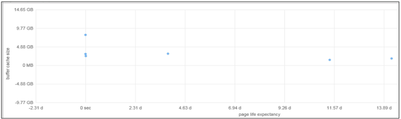
Figure 1
My example from my demo system, above, doesn’t show it, but Scatter plots usually consist of a large body of data. The closer the plotted data points come to making a straight line, the higher the correlation between the two variables, or the stronger the relationship.
In Foglight, you’ll supply the two metric names to use for the plot graph. Maybe you can think of two database performance or resource metrics that you’d like to check for correlation (one grows, does the other grow, or reduce)?
You’ve always been able to create correlation graphs on custom Foglight dashboards, simply by plotting data points of some variables on the same graph. But a Scatter Plot is a sure way to see the correlation quickly – and it’s a commonly used visualization for studying correlations, so others in your organization will be able to interpret it quickly.
Building a Scatter Chart
In my example above, I’m viewing SQL Server page life expectancy related to cache size for each SQL Server instance. Not a lot of correlation there, right? Maybe that’s to be expected, but that’s what I told the view to show me. I was curious. The page life expectancy is definitely higher for some instances, but the cache sizes are very similar, so I know pretty quickly that I should look for another factor that contributes to life expectancy!
To build a Scatter Plot, you need to supply both metric properties with values that are “number” types of metric.
As shown on this screen capture with a Scatter Plot, you can assign actions when the mouse hovers or clicks on a plotted dot (object). I got here by clicking on the little ‘edit’ button in the upper right of the chart, and I chose “edit properties”.
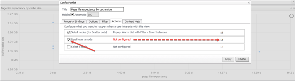
Figure 2
This can be really useful, especially if it’s not real obvious what that dot is representing just looking at the chart – and to drill down to get more details about the plotted object, for example.
Once I click on that button to configure the dwell (hover) action, here I’m choosing to display the Top SQL for the plotted SQL Server instance I hovered on:
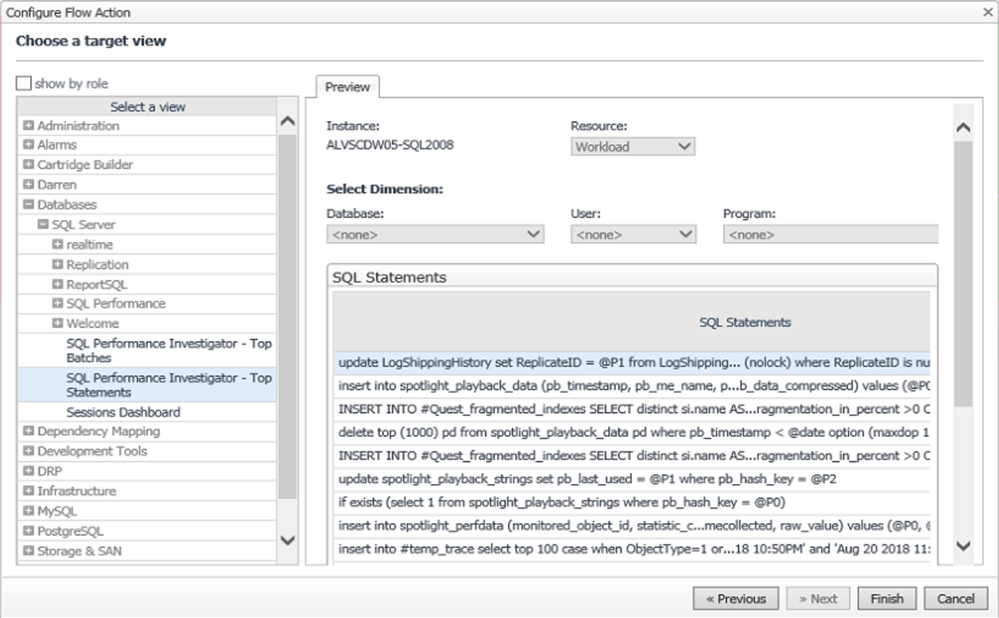
Figure 3
On a Scatter Plot, you can also define your Action to be on “select nodes” or a selection of the plotted points. Define what you want to display when you choose the points on the chart, then you’ll be able to draw a box around multiple dots and you’ll see your selected pop-up or whatever.
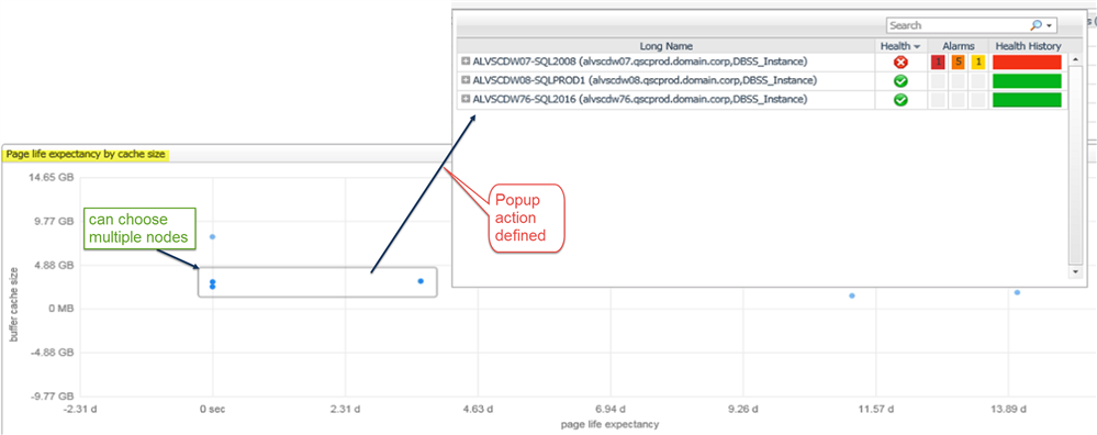
Figure 4
The Bubble Chart
Another version of a scatter chart is the bubble chart. A bubble chart is a type of chart that displays three dimensions of data. Points on the chart are replaced with bubbles. You add one more metric value to the relationship – the third metric determines the size of the plotted “bubbles”.
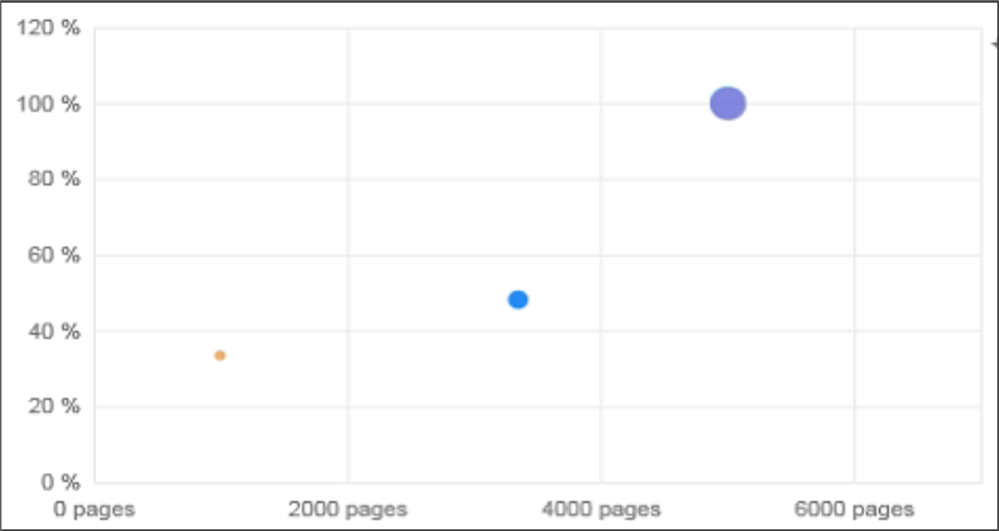
Figure 5
So, consider using a bubble chart if your data has three data series that each contain a set of values. The sizes of the bubbles are determined by the values in the third data series.
In my example here, I’ve plotted a cache hit ratio with the size of the cache (in this case, bufferpools), and the bubble size shows the relative amount of I/O performed through each bufferpool – I see correlation, the larger the bufferpool, the higher the hit ratio – and, the more I/O that used that bufferpool, so all is as I would have suspected given the way I’ve designed the pools and tried to divide up the I/O among them. Good to know – at a glance!
Building a Bubble Chart
Here’s an example of a Bubble Chart. Again, akin to the Scatter Plot, but with a third metric that controls the size of the plotted node or dot.
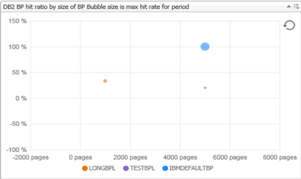
Figure 6
So, to build a Bubble Chart, you need to supply both metric properties with values that are “number” types of metric, as well as a Size metric.
This example is showing the same bufferpool chart as the Scatter Plot a few slides ago but notice that the plotted nodes (bubbles) are different sizes. That’s because I’ve defined the size of each bubble to be the maximum hit rate during the time period depicted. The plotted hit rate is the average. I wanted to know if there had been big fluctuations in the hit rate and if it only happens to certain buffer pools.
The Tree Map Chart
A Tree Map is a birds-eye-view of the relationships of some metrics. It’s a high-level view. This is not the kind of chart that you look for details, or values of things, but it’s meant to convey some insights at a glance. The focus is on the magnitudes of two metric values. One metric’s values will control the size of each rectangle on the chart, the other metric will control the color. You see the label of the “thing” represented…like database instances, for example….so you know immediately what to investigate further, the investigative time is warranted pretty quickly by glancing at the chart – you don’t have to look at lists of things on a report to see which instances have the most alarms and the highest severity, in this example.
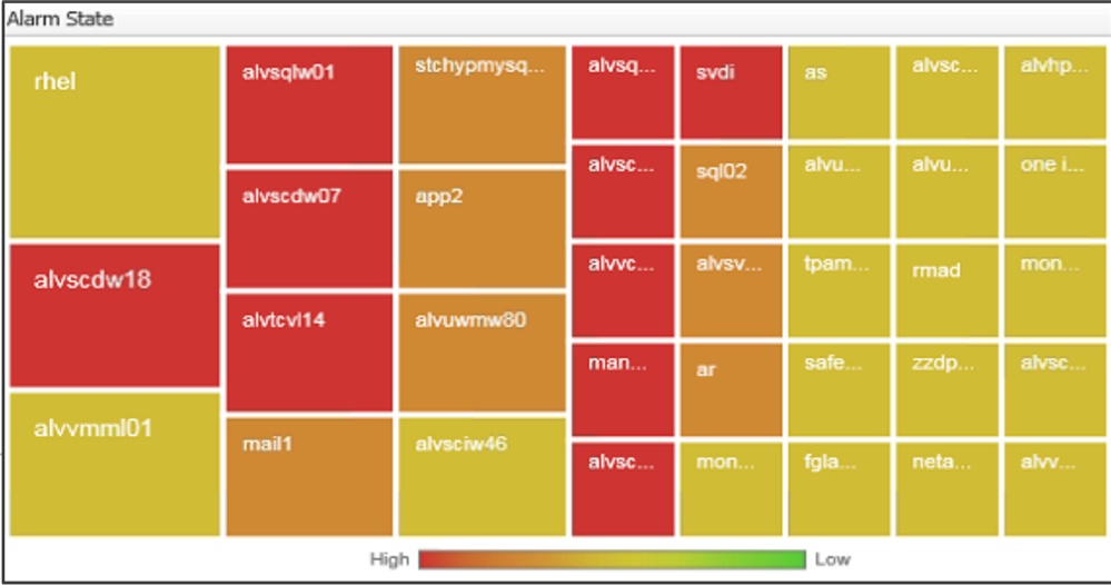
Figure 7
Being “highlight” kinds of views, Tree maps are economical – they take up limited space but can display a large number of items simultaneously. You might see correlation between color and size in the tree structure, and see patterns that would be difficult to spot otherwise.
Building a Tree Map Chart
Here’s an example of a Tree Map. This one shows buffer pool hit ratios for a time period: the average value is color; the max is size of the rectangle.
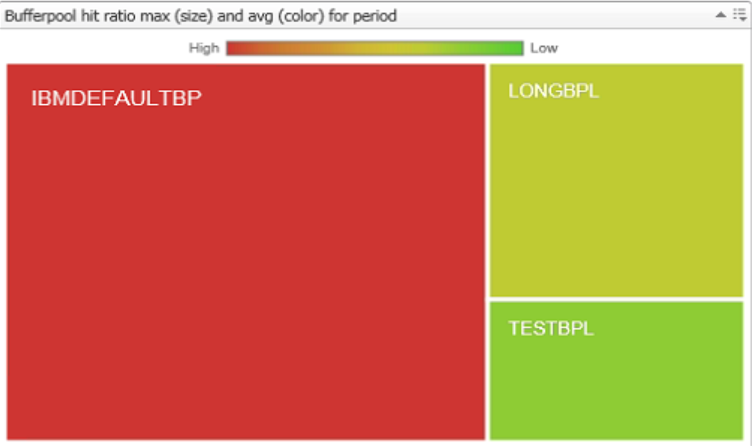
Figure 8
To build a Tree Map, you need to supply a Size property value that’s a “number” type of metric.
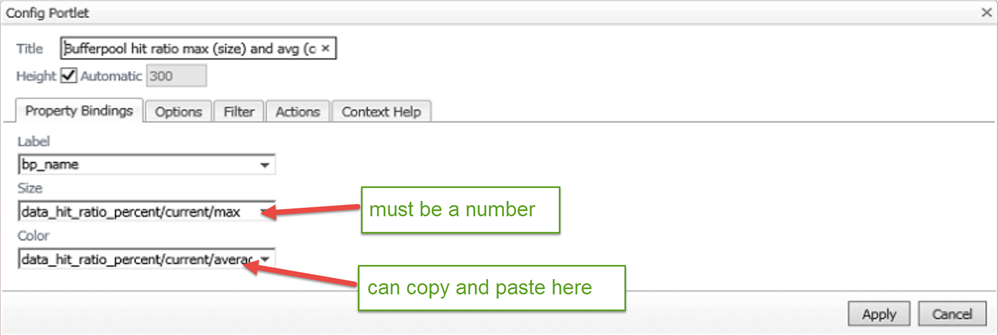
Figure 9
The Color field is optional, but if you fill it in even with the same metric name you used for Size, you’ll see a color range gauge, high to low, to give you a better idea at a glance of where each mapped object relates to the others. If you leave Color blank, Foglight provides color differences for the mapped objects on the Tree Map, but you don’t see that handy gauge.
Remember, you need to tell Foglight what each mapped object is representing, and that’s where the “Label” comes in. I used the monitored bufferpool name on my example here – it kind of makes sense, since I chose bufferpools as the objects to Map. But the new Map won’t automatically show those names on the mapped object blocks.
You might want to give the view a descriptive title, as I’ve done here, otherwise it will show with the default name TREE MAP CHART.
You can copy and paste in these fields, too, so you don’t have to navigate the metric list for each field if you’re going to use the same one for Color as you used for Size.
More Drag-and-Drop Dashboard Tips
Let’s review a few things about drag-and-drop that will help you make better use of the new Analytic Views and other components:
- You’ll need to decide if the dashboard you’re creating will be private or shared with other Foglight users. That’s controlled through Foglight “ROLES”.
- You can look up “Allowed Roles” and “Relevant Roles” in the Foglight user guide, either in the document available on the Quest Support site or in the online help in Foglight. There are blog and forum posts on the Quest Community about this, too. In a nutshell, you set Relevant Roles on the dashboard’s properties and only users with one of those Relevant Roles will be able to view the dashboard. That’s a mechanism you can use to lock down access to dashboards, or to make them visible to “limited view” users like executives (you could set up users/roles so that some could ONLY see dashboards you want them to see).
- The Layout of the dashboard can be fixed or one-, two-, or three-column. If fixed, you can place things and size them any way you want on the screen. In column layout, you add graphs and views in columns. If you use fixed layout, you can add a background image, and you can move things and size things any way you want
- You can edit the properties, any properties, after you’ve created the new dashboard. Use the “Edit Properties” option in the Action Panel for dashboard-wide settings, or use the button on the upper right corner of a particular view on the dashboard to change the behavior of that specific component.
Building Analytic Views – using a pre-built WCF customization
Back in section 2, I brought up WCF, the Web Component Framework – the Foglight IDE for dashboards and reports. Quest teams are beginning to build customizations of the new Analytic Views using WCF, for specific uses, and some of them will become available soon as “community supported” cartridges that you’ll be able to plug into your Foglight management server.
For example, here’s a screen capture of a Service Tree Map, a customized specific use of the new Tree Map feature:
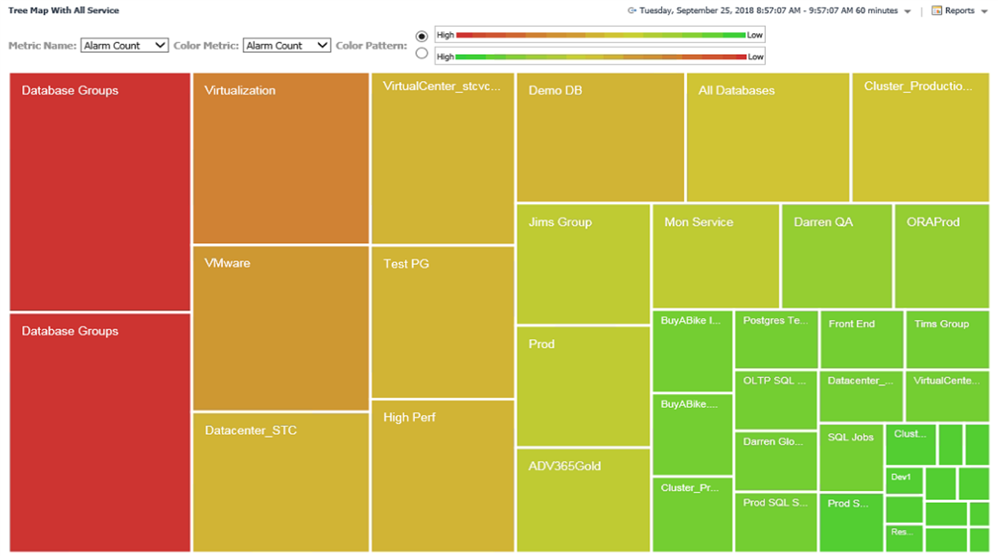
Figure 10
The size of each rectangle depicts the number of alarms for each Foglight service. The color depicts the highest alarm severity for each service during the chosen time frame.
The fields at the top of the screen are the customizations – you can toggle the selections very easily using these custom input parameter fields. The OOB tree map allows you to change input metric names, but not on the screen like this. So, customizations can provide flexibility and ease of use for the user.
If this particular customization of the Tree Map that depicts alarm status of your Foglight Services you’ve defined looks useful to you, consider downloading the cartridge file from here:
https://github.com/Foglight/WCF-Demo/tree/master/Packaged%20Cartridges
This is a community-supported cartridge for the “services” view, so you will use it “as is”. If you need assistance with it, the Quest Community forum is a great place to ask questions – responses and help might come from other customers who have tried it or from Quest employees who monitor the forum, here: http://www.quest.com/community/products/foglight.
To find out more about Foglight for Databases, visit the product page on quest.com: http://www.quest.com/foglight
-

Chris.Jones
over 6 years ago
-
Cancel
-
Up
0
Down
-
-
Reply
-
More
-
Cancel
Comment-

Chris.Jones
over 6 years ago
-
Cancel
-
Up
0
Down
-
-
Reply
-
More
-
Cancel
Children